Hey friends, today in this blog you’ll learn Create A Javascript Clock | CSS Neumorphism Analog Clock UI Design . We’ll use HTML CSS & JS to create this awesome Neumorphism Analog Clock . Earlier I’ve shared a blog on How To Create Testimonial Slider Using HTML CSS JavaScript .
I have also created a full video tutorial of this Javascript Clock , you can also watch a video tutorial. I Hope this tutorial will be helpful.
Video Tutorial of “Create A Javascript Clock“
You might like this:
- Responsive Image Slider
- Download Button With Countdown Timer | Using Html Css Js
- Create A Music Player Using Javascript | Javascript Audio Player
- How to Create Resume CV Website Using HTML CSS Bootstrap4
- How create an Online Store Website Using Htm Css JS | Multi Page Website
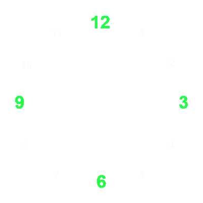
Firstly You Download This Image-

CSS Neumorphism Analog Clock [Source Codes]
To create this Javascript Clock . First, you need to create Three files, HTML File , CSS File and JS File . After creating these files Just copy the given source code and paste into your text editor and edit it according to your requirement. You can also download the source code files of this Javascript Clock from the given download button.
# HTML CODE
First, create a Html file (index.html) and paste the given codes in your CSS file.
<div class="clock">
        <div class="hour">
            <div class="hr" id="hr"></div>
        </div>
        <div class="min">
            <div class="mn" id="mn"></div>
        </div>
        <div class="sec">
            <div class="sc" id="sc"></div>
        </div>
    </div>
# CSS CODE
Second, create a CSS file (style.css) and paste the given codes in your CSS file.
body{
    display: flex;
    justify-content: center;
    align-items: center;
    height: 100vh;
    background-color: #091921;
}
.clock{
    width: 300px;
    height: 300px;
    background-image: url("clock.png");
    border-radius: 50%;
    background-size: cover;
    display: flex;
    justify-content: center;
    align-items: center;
    box-shadow: 0 -15px 15px rgba(255, 255, 255, 0.05),
    inset 0 -15px 15px rgba(255, 255, 255, 0.05), 0 15px 15px rgba(0, 0, 0, 0.3),
    inset 0 15px 15px rgba(0, 0, 0, 0.3);
}
.clock::before{
    content: "";
    width: 15px;
    height: 15px;
    position: absolute;
    background-color: #fff;
    border-radius: 50%;
    z-index: 1000;
}
.hour,
.min,
.sec{
    position: absolute;
}
.hr{
    width: 160px;
    height: 160px;
}
.mn{
    width: 190px;
    height: 190px;
}
.sc{
    width: 230px;
    height: 230px;
}
.hr,
.mn,
.sc{
    display: flex;
    justify-content: center;
}
.hr::before{
    content: "";
    width: 8px;
    height: 80px;
    background-color: #06fd2f;
    z-index: 100;
    border-radius: 5px;
}
.mn::before{
    content: "";
    width: 6px;
    height: 90px;
    background-color: rgba(15, 105, 207);
    z-index: 11;
    border-radius: 5px;
}
.sc::before{
    content: "";
    width: 2px;
    height: 140px;
    background-color: #fff;
    z-index: 10;
    border-radius: 5px;
}
# JS CODE
Last, create a JavaScript file( script.js ) and paste the given codes in your JavaScript file.
 const deg = 6; //360deg / 60(min||sec) => 6
        const hr = document.querySelector("#hr");
        const mn = document.querySelector("#mn");
        const sc = document.querySelector("#sc");

        setInterval(() => {
            let day =  new Date();
            let hh =  day.getHours() * 30; //360deg / 12 hour => 30
            let mm = day.getMinutes() * deg;
            let ss = day.getSeconds() * deg;

            hr.style.transform = `rotateZ(${hh + mm / 12}deg)`;
            mn.style.transform = `rotateZ(${mm}deg)`;
            sc.style.transform = `rotateZ(${ss}deg)`;

        });
        // coding with nick
That’s all, now you’ve successfull Create A Javascript Clock | CSS Neumorphism Analog Clock UI Design . If your code doesn’t work or you’ve faced any error And problem’s , please download the source code from the given download button.
I Hope this blog will be helpful.
Read More –

